Boost Retail Strategy with These 3 Data Visualization Types
Reading Time: 6 Minutes
Being a pricing or promotions professional for a leading retailer can be a thankless task.
The amount of data in which you consume and analyze grows exponentially as well as the demands for answers that are placed upon you by various stakeholders. Often, the data is not optimized or accessible, and the tools that you have at your disposal are archaic or ill equipped to handle your requirements.
We hear your pain! We want to share one way that you can score points with your boss.
Data visualization.
Great tools like Tableau, Domo, or Qlik have been around for a while, and you are no doubt aware of their ability to transform massive volumes of data into actionable insights.
Our solution is integrated with Tableau and retailers greatly benefit from its capabilities.
We’re sharing 3 common visualizations that have proven to be impactful in a retail setting and how they can convey valuable insights that you might be looking to share.
The Scatter Chart
This is a true workhorse, especially if you are looking to show the overall relationship in a large amount of data.
It’s a great way to summarize data with two variables.
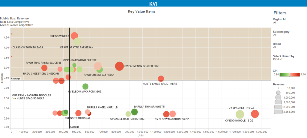
One useful application in a retail setting is to map out profit and sales by store in order to quickly determine which stores are driving the most value. If you want to add a third variable you can upgrade to using a Bubble Chart. This is useful when comparing items in terms of their relative value, size, or position.
The example below graphs pasta and sauces by volume, elasticity, consumer price index (CPI) and even squeezes in a fourth variable in revenue. This is very helpful in understanding things like which categories are performing above/below expectations or where the best revenue or profit opportunities can be uncovered.
Box Plot
A box plot is very useful to show the distribution of a data set.
You can configure lines, called whiskers, to display all points within a defined range (or all points at the maximum extent of the data).
It can be used by analysts to visually display the range of prices a product might have across a region by competitors.
Opportunity Curve
You might remember this from your economics course, and it can be a little more difficult to chart out, but it is a very powerful way to visually demonstrate where you currently stand relative to potentially more efficient alternatives.
When you know the elasticity of your products this can be very helpful in determining the most efficient price in terms of profit or revenue optimization.
This is just the start!
Data visualization is a powerful way to illustrate meaningful trends and insights.
It plays a valuable role in summarizing trends or findings for executive dashboards.
In short, time is short, we are taught to cut to the chase, and data visualization can quickly get to the point of the matter without the additional time required to explain and present information the old-fashioned way.


How One Grocery Retailer Used Price Optimization to Boost Profit +2.78%
When you’re a premium grocery retailer, every price point matters. Discover how a leading grocery retailer, facing the everyday challenges of the retail
Read
2026 Grocery Pricing Readiness Checklist: Compete Smarter with Data, Elasticity, Optimization
With new year planning underway, grocery category managers and pricing teams are asking, » Where do my prices stand in the market? »
Read
Why Price Wars Hurt Grocers – and What to Do Instead
Most grocers can’t point to which price changes drive profit (or which ones quietly destroy it). That’s because pricing decisions are reactionary. Cut
Read
KVI Analysis: How a Few SKUs Can Transform Your Price Image
Shoppers don’t memorize every price throughout your store. They remember a handful of high-visibility items and use those prices to judge your overall
Read
Pricing with Confidence: How Grocers Turn Pricing Science into Strategy
When it comes to grocery retail, pricing isn’t just about numbers… it’s about strategy, perception, and purpose. Grocery retailers have more data than
Read
Everyday “Fair” Pricing – The End of Hi-Lo as We Know It?
Is Alix Partners on to something? Every shopper loves a deal and today, finding one only takes a swipe. With smartphone in hand,
Read Assortment Analytics for Grocery Retailers: How to Cut Cost, Not Opportunity
The right assortment drives trip frequency, basket size, and shopper loyalty. You’re probably carrying more SKUs than you need. And that’s not just
Read
Master Pricing: The Blueprint for Grocery Price Optimization
“The days of spreadsheets and gut-feel pricing are behind us,” said Steve Thornberry, VP of Sales at ClearDemand. “Retailers need science-backed decisions that
Read
Grocery Promotions That Perform: Forecasting Is the Key
Every grocer knows the drill: build the flyer, push the promos, hope for the lift. But week after week, many promotions fail to
ReadThe Latest Insights – Straight to Your Inbox
Sign up for the ClearDemand mailing list for actionable strategies, upcoming events, industry trends, and company news.